Excel Dashboard Tutorial
What Makes a Great Excel Dashboard
A dashboard isn't just multiple charts thrown on a page — it's a decision-making tool. The best dashboards answer key business questions at a glance: Are we on track? Where are the problems? What needs attention now? They combine data visualization, interactivity, and clear layout to turn raw data into actionable insight.
Building a dashboard in Excel requires a different mindset from building a regular spreadsheet. You're designing for consumption, not exploration. Every element on screen must justify its existence.
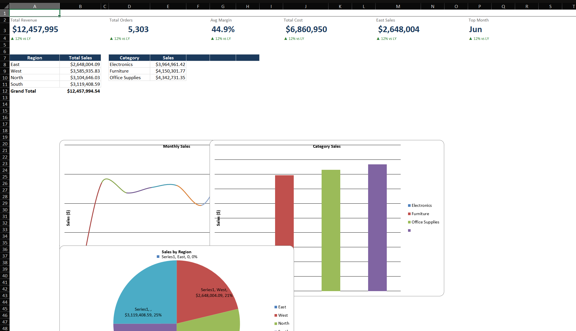
Step-by-Step: Build a Sales Dashboard
Scenario: Build a one-page dashboard showing total sales, monthly trend, top products by region, and interactive filtering.
Step 1 — Set up the data layer (separate sheets)
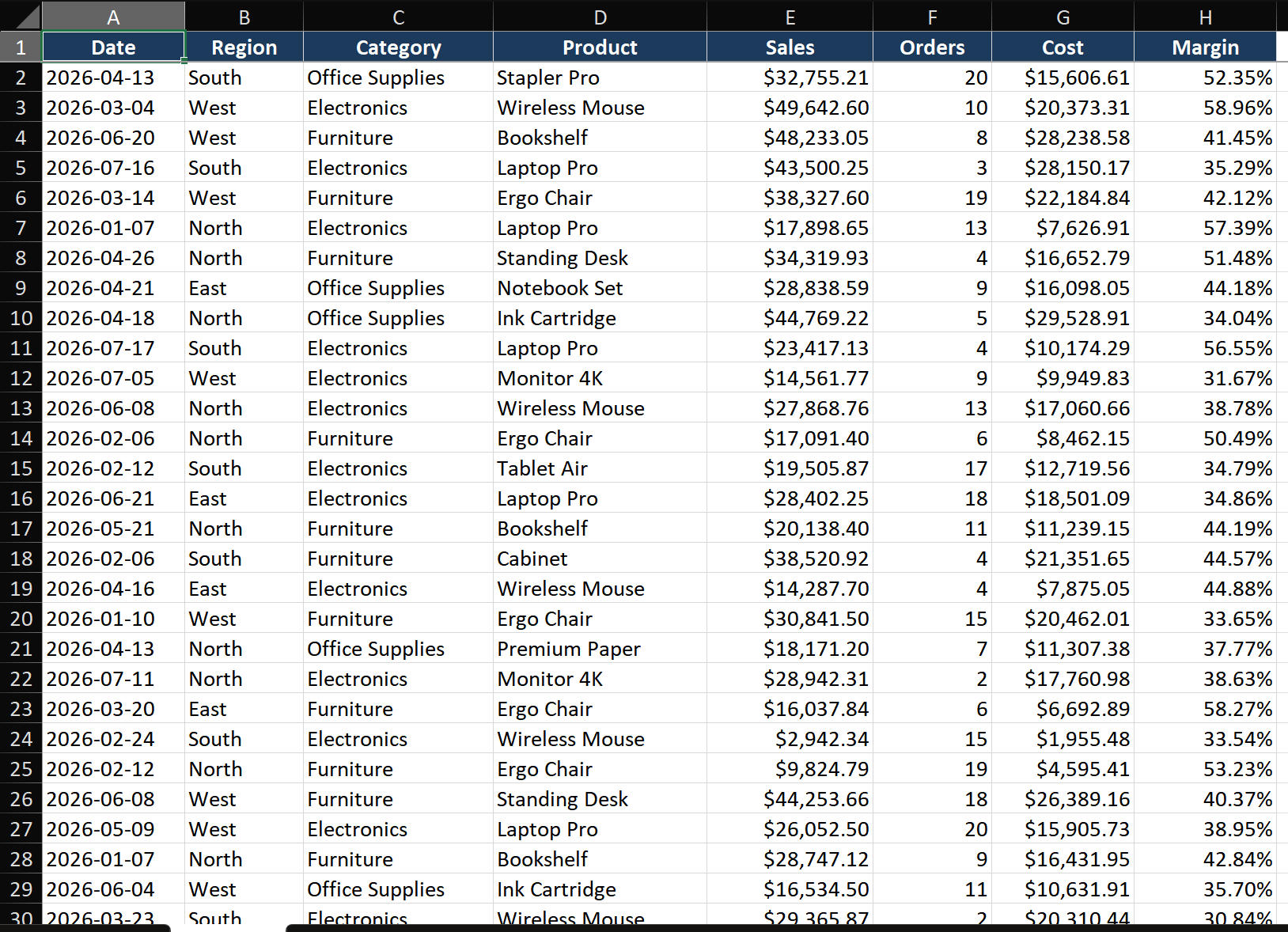
- Create three sheets: RawData (your source data as an Excel Table), Calculations (Pivot Tables and helper formulas), Dashboard (the final display).
- On Calculations, create Pivot Tables for each dashboard element: one for monthly sales trend, one for top products, one for regional breakdown.
- This layered approach means you update data in RawData, refresh Calculations, and the Dashboard updates automatically. Troubleshooting becomes trivial — check each layer independently.
Step 2 — Build KPI cards
- On the Dashboard sheet, merge a 3×3 cell area (B2:D4) for your first KPI card.
- In the merged cell, type
Total Revenueas the label (font: 10pt, gray). Below it, enter the formula=GETPIVOTDATA("Sales", Calculations!$A$3)or a direct SUMIF from RawData. Format the number: 20pt, bold, dark gray. - Add a small sparkline below the number: Insert > Sparklines > Line, select the 12 monthly totals as the data range. This shows the trend direction at a glance.
- Repeat for 3 more KPI cards: Total Orders, Average Margin, and Top Product.
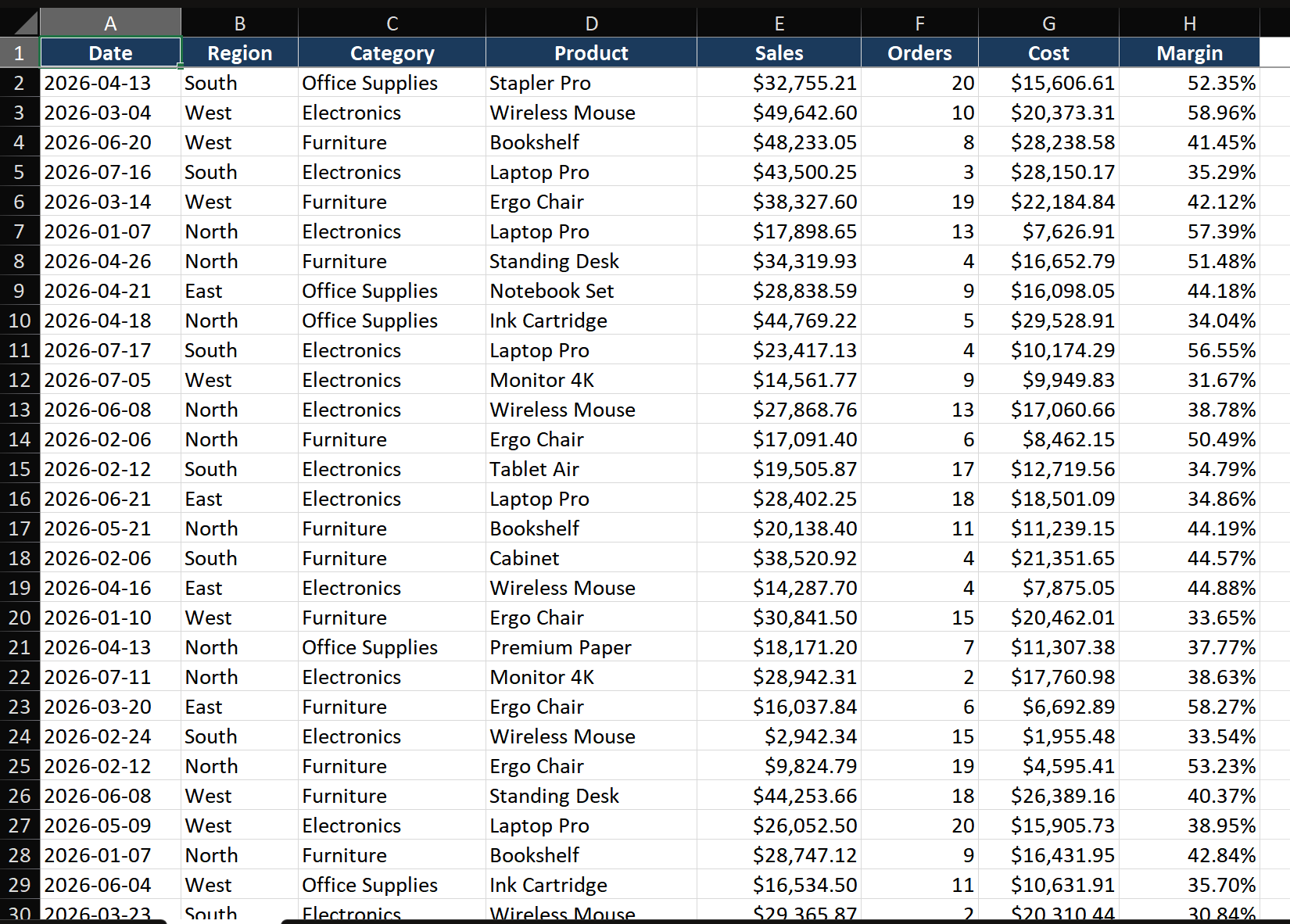
Step 3 — Add charts from the Calculations Pivot Tables
- Click inside the monthly sales Pivot Table on the Calculations sheet. Insert > Line Chart. Cut the chart (Ctrl+X) and paste it onto the Dashboard sheet.
- Format the chart: remove gridlines and border, set line color to your dashboard's primary accent color.
- Repeat for the top products bar chart and regional breakdown pie/bar chart.
- Align all charts: select multiple charts (Ctrl+click), then Shape Format > Align > Align Left and Distribute Vertically.
Step 4 — Connect slicers for interactivity
- Click one of the Pivot Tables on the Calculations sheet. Insert > Slicer > select Region and Product Category. Two slicers appear.
- Cut and paste the slicers onto the Dashboard sheet. Position them in the top-right area.
- Right-click a slicer > Report Connections. Check ALL Pivot Tables that should respond to this slicer. Now clicking "East" in the Region slicer filters every chart simultaneously.
- Format slicers: right-click > Size and Properties > set columns to 2-3 for compact layout. Style them to match your dashboard color scheme.
Step 5 — Protect and polish
- Hide gridlines: View > uncheck Gridlines.
- Set the dashboard background to white or a very light gray (select all cells, fill color).
- Unlock slicers first: right-click each slicer > Size and Properties > Properties > Don't move or size with cells.
- Then protect the sheet: Review > Protect Sheet. Allow "Use PivotTable & PivotChart" and "Edit objects." This locks the layout while keeping slicers functional.
- Hide the RawData and Calculations sheets: right-click tab > Hide.
Key Techniques
- Dynamic chart titles: Use
=IF(HASONEVALUE(Slicer_Region), "Sales: " & VALUES(Slicer_Region), "Sales: All Regions")so chart titles update with slicer selections. - Grid-based alignment: Enable Snap to Grid (Page Layout > Align > Snap to Grid). Use consistent column widths as your layout grid — everything snaps into perfect alignment.
- Conditional formatting on KPI cards: Add icon sets or color the card backgrounds green/red based on target achievement.
- Hyperlink navigation: Use shapes linked to cells that contain hyperlinks to create a navigation ribbon — no VBA needed.
Common Mistakes
- Information overload. If you can't identify the top 3 numbers in 5 seconds, the dashboard is too crowded. Ruthlessly cut any element that doesn't answer a core question.
- Mixing time periods. One chart shows YTD, another MTD, a third rolling 12 months — confusion is guaranteed. Use consistent timeframes across all elements, or label each clearly.
- Red-green color reliance. 8% of males are red-green colorblind. Add arrows, icons, or text indicators alongside colors for accessibility.
- Not versioning your dashboard. Save versions as Dashboard_2026-01.xlsx. When stakeholders ask "can we go back to last month's version?", you can.
Advanced Tips
- Scrollable dashboards with form controls: Developer tab > Insert > Scroll Bar, link to a cell driving OFFSET formulas. Users scroll through time periods or long category lists within a fixed dashboard area.
- Power Query data refresh automation: Connect dashboard to external data via Power Query. Set Data > Queries & Connections > Properties > Refresh every X minutes for live dashboards.
- Conditional formatting heatmaps in table dashboards: Apply color scales across entire table columns for instant pattern recognition — your tables read like charts.