Excel Charts & Visualization
Why Charts Beat Numbers Every Time
A well-designed chart communicates in seconds what a page of numbers takes minutes to explain. Excel's chart engine is remarkably capable — from simple column charts to complex combination charts with secondary axes, trendlines, and dynamic ranges. Yet most users barely scratch the surface, accepting defaults that produce cluttered, unprofessional results.
This guide focuses on creating charts that actually communicate: choosing the right type, stripping away chart junk, and building visualizations that make your data impossible to ignore.
Step-by-Step: Build a Professional Sales Chart
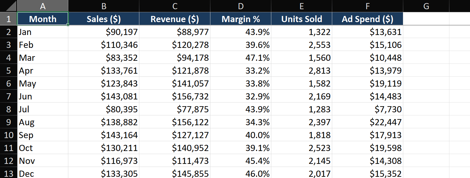
Scenario: You have monthly sales data (Jan-Dec in column A, Sales Amount in column B). Create a chart that highlights the best and worst months.
Step 1 — Select data and insert a chart
- Select range A1:B13 (including headers). Press Alt+F1 to insert a default chart on the same sheet.
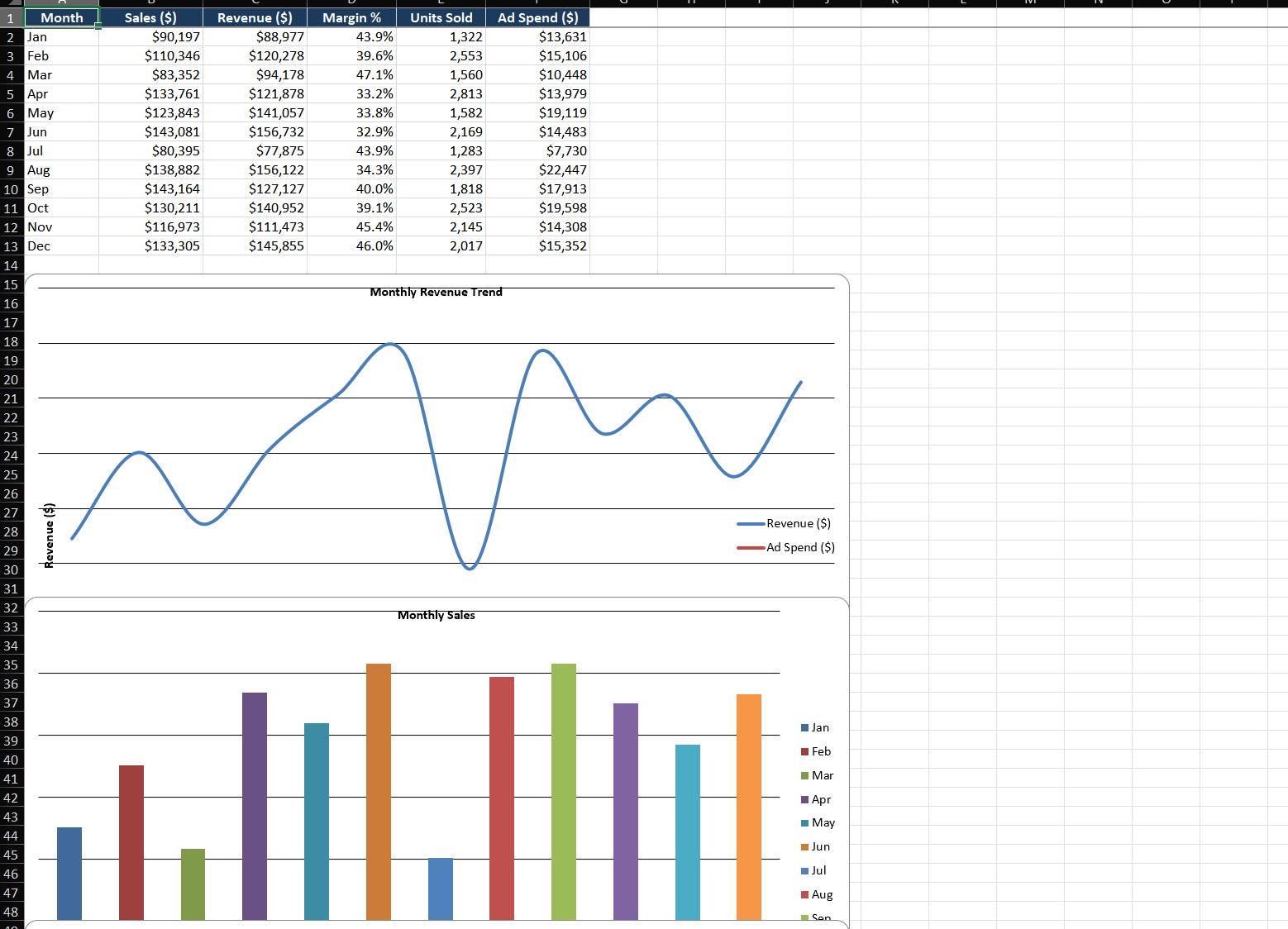
- Excel inserts a clustered column chart. For time-series data, let's switch to a line chart: Chart Design > Change Chart Type > Line > Line with Markers.
- Resize the chart: drag corner handles while holding Alt to snap to cell gridlines — this keeps charts perfectly aligned in dashboards.
Step 2 — Remove chart junk
- Click the chart, then click the + icon (Chart Elements) that appears at the top-right.
- Uncheck: Gridlines (they add visual noise without information), Legend (unnecessary for a single-series chart).
- Check: Data Labels, but only if they add value. For line charts, label only key points.
- Click the chart border and set Shape Outline > No Outline to remove the border box.
Step 3 — Format with purpose
- Click the line > Format Data Series > Fill & Line > set width to 2.5 pt for visibility.
- Click individual data points (click once to select the series, then click again on a point) and format the max value point with a distinct color and larger marker.
- Click the vertical axis > Format Axis > Axis Options > set Minimum to 0 (column and bar charts should always start at zero to avoid exaggerating differences).
- Click the chart title, then click the formula bar. Type
=, click cell A1 (which contains "Monthly Sales 2026"). The title now links to that cell — change the cell, and the chart title updates automatically.
Step 4 — Add a trendline with equation
- Click the chart, Chart Elements (+) > Trendline > More Options.
- Choose Linear. Check Display Equation on chart and Display R-squared value.
- The equation (y = mx + b) shows the trend direction and slope. R² closer to 1.0 means a stronger trend.
- Format the trendline: dashed line, lighter color, 1 pt weight — it should support the data, not compete with it.
Key Techniques
Technique 1 — Combo chart with secondary axis
When charting values with different scales (revenue in millions vs. margin in percentages), a secondary axis is essential:
- Select your data (Month, Revenue, Margin %). Insert a Combo chart.
- Set Revenue as Clustered Column, Margin % as Line. Check Secondary Axis for Margin %.
- The left axis shows revenue ($), the right axis shows margin (%). Format each axis with appropriate number formatting.
Technique 2 — Dynamic chart ranges with Tables
- Convert your source data to an Excel Table (Ctrl+T).
- Create the chart from the Table. When you add new rows to the Table, the chart automatically includes them — no manual range adjustment needed.
- For non-Table data, create a named range using OFFSET:
=OFFSET(Sheet1!$A$1, 0, 0, COUNTA(Sheet1!$A:$A), 1), then set the chart series to use that name.
Common Mistakes
- Using 3D charts. 3D effects add zero information while making values harder to read accurately. Perspective distorts bar heights. Always use 2D.
- Truncating the Y-axis. Starting the Y-axis above zero exaggerates small differences. For bar and column charts, always start at zero. For line charts, a non-zero baseline is acceptable but must be clearly labeled.
- Too many data series. A line chart with 15 series becomes spaghetti. Group related series, use small multiples (one chart per category), or consolidate minor series into "Other."
- Relying on legends for identification. Readers shouldn't have to bounce between legend and data. Label lines, bars, or endpoints directly on the chart.
- Inconsistent colors across charts. If blue means "East Region" in one chart, it must mean "East Region" in every chart in the report. Consistent color coding builds intuitive understanding.
Advanced Tips
- Sparklines for in-cell trend indicators: Insert > Sparklines > Line. Place in cells next to data for compact trend visualization. Perfect for dashboards where space is tight.
- Camera tool for live chart snapshots: Add the Camera tool to your Quick Access Toolbar. It creates a live linked image of any range or chart you select — freely resize and position it independently from the original, ideal for dashboard layouts.
- Custom error bars for confidence intervals: Chart Elements > Error Bars > More Options > Custom > Specify Value. Link error amounts to cells containing calculated standard deviations or confidence intervals.
- Waterfall charts for financial analysis: Insert > Waterfall chart shows how an initial value is affected by positive and negative changes — ideal for P&L breakdowns, budget variance, and inventory flow.