Excel Pivot Tables Tutorial
Why Pivot Tables Are Excel's Superpower
A Pivot Table takes thousands of rows of raw data and summarizes them into a readable report in seconds — without writing a single formula. You drag and drop fields into four zones (Rows, Columns, Values, Filters), and Excel handles all the aggregation. Want to see sales by region? Drag Region to Rows, Sales to Values. Done. Now swap Region for Product Category — the entire report restructures instantly.
Pivot Tables are interactive, refreshing, and are the engine behind most professional Excel dashboards. If you've ever spent hours building SUMIF formulas to summarize data, Pivot Tables will transform your workflow.
Step-by-Step: Build Your First Pivot Table
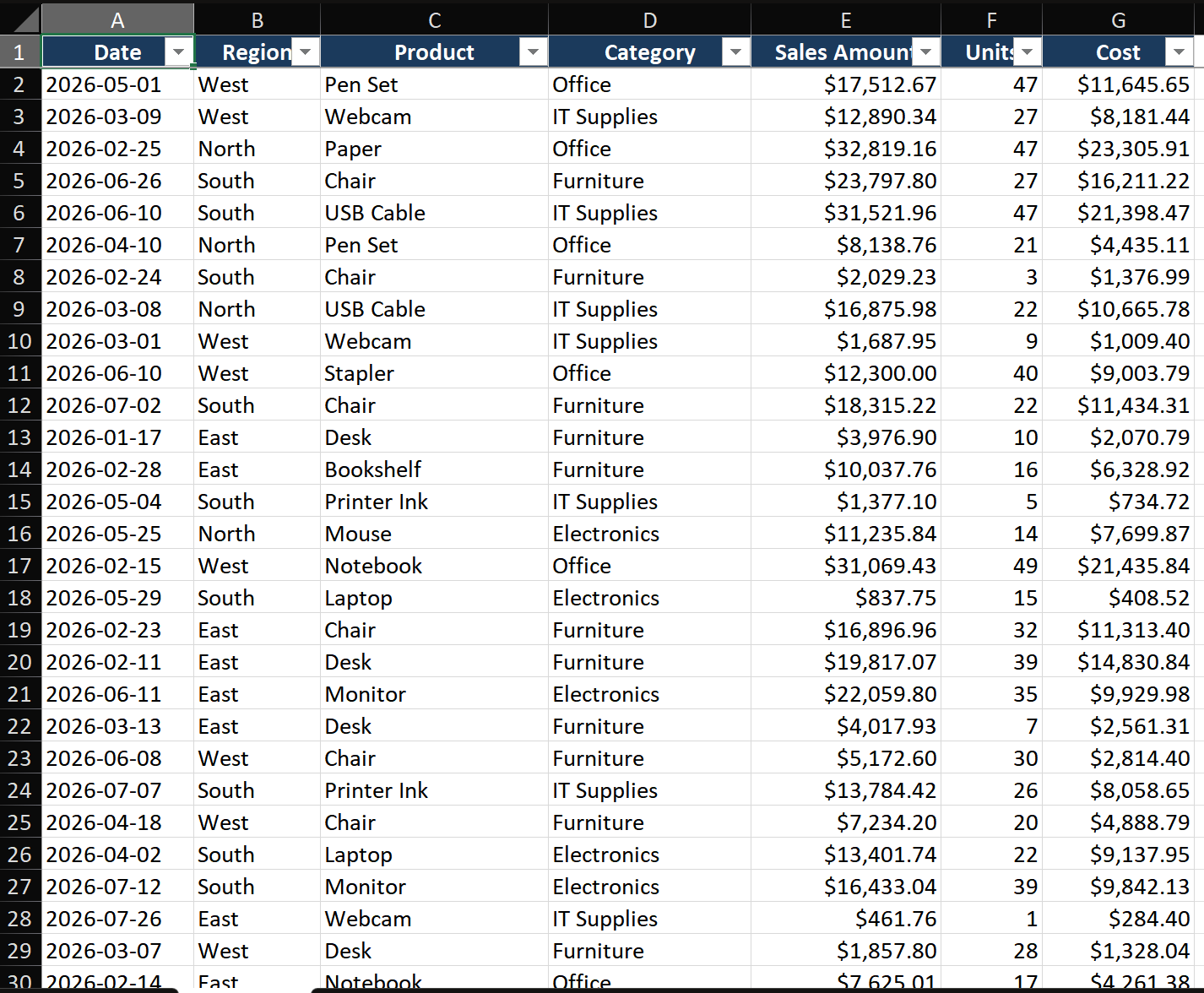
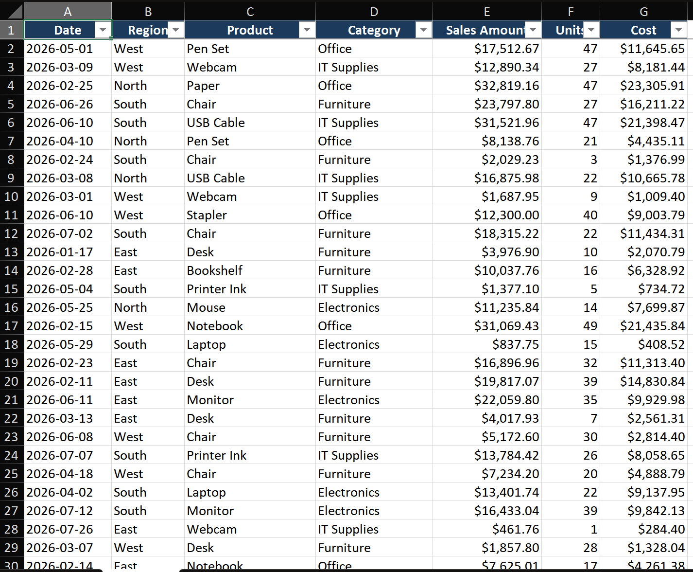
Scenario: You have 2,000 rows of sales transactions (Date, Region, Product, Category, Sales Amount, Units). You need a report showing total sales by region and product category.
Step 1 — Prepare your source data
- Make sure every column has a header and there are no blank rows inside the data.
- Click any cell inside the data, press Ctrl+T to convert to an Excel Table. Name it
SalesData. - Why a Table? Tables auto-expand — when you add new rows next week, the Pivot Table will include them after a simple refresh.
Step 2 — Insert the Pivot Table
- Click any cell inside your SalesData table.
- Go to Insert > PivotTable (or press Alt+N+V).
- Excel auto-selects the entire SalesData range. Verify it's correct.
- Choose New Worksheet (keeps things clean) and click OK.
- A blank Pivot Table appears on a new sheet, with the Fields pane open on the right.
Step 3 — Build the report by dragging fields
- In the Fields pane, check Region. It automatically goes to the Rows zone. You'll see a list of regions appear on the left.
- Check Category. It also goes to Rows, appearing below each Region — creating a hierarchical breakdown.
- Check Sales Amount. It goes to Values and shows as "Sum of Sales Amount". Numbers appear in the grid.
- To see Category as columns instead: drag Category from Rows to Columns. Now you have a cross-tab: regions down the left, categories across the top, sales amounts in the intersection.
Step 4 — Format numbers and apply a style
- Right-click any number in the Values area > Number Format > Currency, 0 decimal places.
- Go to PivotTable Analyze > PivotTable Styles and pick a clean style (avoid the gaudy defaults — Medium 2 or Light 16 work well).
- Right-click a Region label > Field Settings > Layout & Print > check "Repeat item labels". This fills every row with the region name instead of showing it only once.
Key Techniques
Technique 1 — Group dates intelligently
- Right-click any date in the Pivot Table > Group.
- Select Months, Quarters, and Years (hold Ctrl to multi-select). Click OK.
- Now your daily transactions roll up to monthly or quarterly summaries. Drag Years to Filters for an instant year-over-year view.
- To group by weeks: set Days to 7 in the Grouping dialog.
Technique 2 — Add a Calculated Field for custom metrics
- PivotTable Analyze > Fields, Items & Sets > Calculated Field.
- Name it
Profit Margin. Formula:= (Sales - Cost) / Sales. - Format the result as a percentage. This field now behaves like any other — you can drag it anywhere.
Technique 3 — Show values as % of total
- Right-click a value > Show Values As > % of Grand Total.
- Instantly see each cell's contribution. Also try % of Row Total or % of Column Total for different perspectives.
Common Mistakes
- Source data has blank rows. Even one blank row causes Excel to think the data ends there. Delete blank rows or convert to a Table before creating the Pivot.
- Forgetting to Refresh. Changed source data? Right-click the Pivot > Refresh (or Alt+F5). New rows, values, or corrections don't appear until you refresh.
- Dragging text fields into Values. Text fields default to Count. If you need Sum, the source column must contain actual numbers, not text-formatted numbers.
- Too many slicers with overlapping filters. When data seems "missing," check all active slicers, timeline controls, and report filters.
Advanced Tips
- Build interactive dashboards with Slicers: Insert > Slicer, pick Region and Category. Connect one slicer to multiple Pivot Tables (right-click slicer > Report Connections) for synchronized filtering.
- Use the Data Model for multi-table analysis: When creating the Pivot, check "Add this data to the Data Model." You can then join multiple tables via relationships — no VLOOKUP needed.
- GETPIVOTDATA for formula-based reports:
=GETPIVOTDATA("Sales", $A$3, "Region", "East")extracts a specific value from the Pivot into a formula, perfect for custom report layouts. - Conditional formatting on Pivot Tables: Apply data bars or color scales to Values. Use the "Apply formatting to" dropdown to control whether the format applies to data cells only or also subtotals.